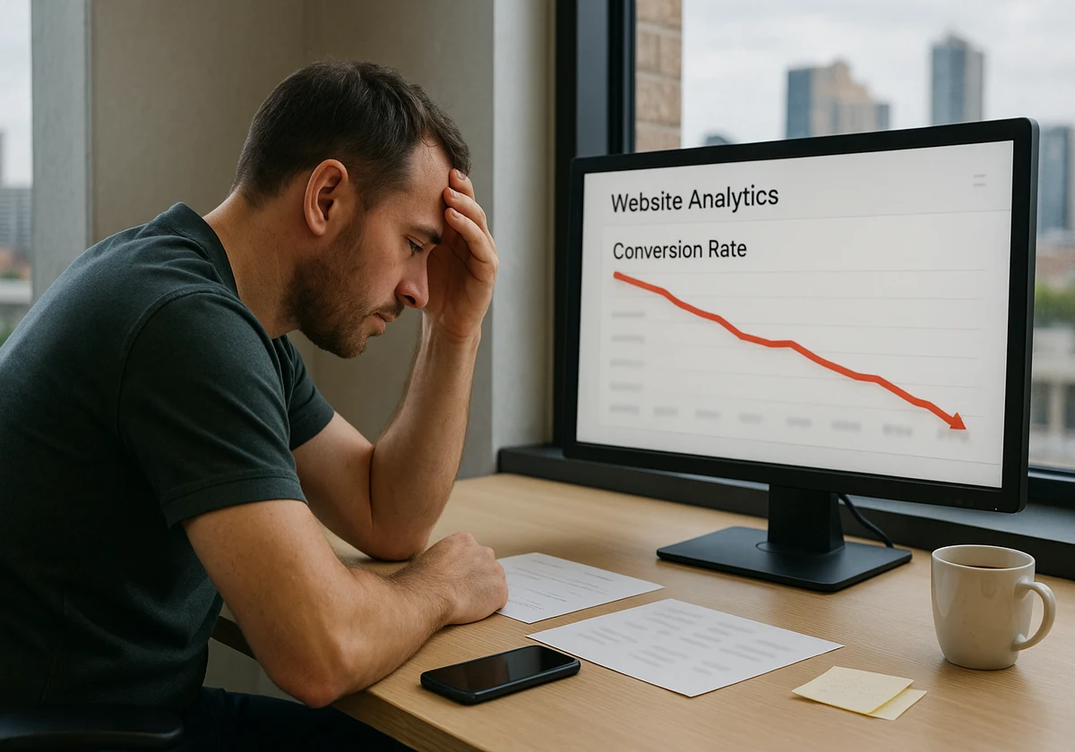
Are you watching your web traffic grow, but don’t see any growth in customers? Believe it or not, your website could be what’s driving people away. Even small web design mistakes can wreck your website conversion rates and send potential clients to competitors instead. In this guide, we will discuss the most common website conversion issues that hurt businesses every day.
You’ll learn about:
- Slow loading times that lose customers instantly
- Confusing menus and broken links damage trust
- Visual clutter overwhelms new visitors and drives them away
- Weak calls to action let potential customers slip through
Bad website design doesn’t have to cost you sales forever. Let’s look at what’s going wrong and how to turn things around.
Slow Pages Lose Customers Fast

Truth be told, your page speed is costing you money right now. Research by Google found that 53% of mobile website visitors will leave if a webpage doesn’t load within three seconds. Which means more than half of your potential customers vanish before they even see what you offer.
Believe us, slow loading time creates problems you can’t ignore:
- First impressions count: Visitors judge your entire business within milliseconds of landing on your site. Basically, a delay of even two seconds makes users assume your company looks unprofessional or outdated. It’s human nature. Adding to that, they might even compare your slow site to other pages and leave before you get a chance to win them over.
- Mobile speed gaps: Phone users deal with slower connections but have even less patience than desktop browsers. If you want to up your game, you have to understand that the speed optimisation process for mobile devices isn’t optional anymore. The only way for you to keep customers is by speeding up your loading time.
- Revenue drops with delays: Fast-loading sites consistently make more sales across every industry. If you reduce that time by just one second, your website conversion rates will climb. Trust us, you will see more users stick around to see your offers instead of leaving in frustration.
The next problem works hand-in-hand with slow speeds to frustrate your visitors even more.
Confusing Menus and Dead-End Links

Speed isn’t the only problem hurting your conversions. A confusing site layout quietly kills sales, too.
Think about what happens when visitors land on your page with a specific goal in mind. Your menu forces potential leads to hunt through five different sections just to find basic information. After two minutes of clicking around with no luck, they give up and leave (take yourself for example, you would do the same too if a page is difficult to access).
On top of that, broken links make the situation even worse. For instance, someone clicks “Our Services” expecting to learn what you offer, but the page returns a 404 error instead.
You need to keep in mind that both menu confusion and broken links work together to destroy trust.
Remember that your site needs to guide visitors smoothly from their first click to the action you want them to take. Instead, confusing menus stop them in their tracks while broken links create frustrating dead ends.
The outcome is predictable: they’ll find another company with a website that helps them get what they need.
When Cluttered Design Drives Visitors Away

Big, ugly websites push customers away because visual clutter overwhelms visitors the second they land on your page. When unnecessary elements fight for attention all at the same time, users don’t know where to focus, so they leave.
Bear in mind that your design needs to help users, not confuse them:
Overwhelming Layouts That Confuse Visitors
Cramming information into every available space creates instant chaos for anyone who visits. Visitors land on your page and can’t figure out where to look first. What’s more, your layout throws everything at them at once with no clear direction.
From our experience, white space gives eyes a place to rest and helps guide attention to the important bits, but cluttered designs ignore the breathing room users need to process information.
Don’t forget that layouts that aren’t visitor-friendly push people away fast because they can’t figure out what to focus on or where to go next.
Outdated Design Elements From Yesteryear
An outdated design makes your business look stuck in the past. For example, tiny fonts force mobile users to zoom in just to read basic information about your services. Plus, colour schemes that clash send the wrong message to potential customers.
When a layout looks ten years old, it makes people wonder if your business can keep up with modern demands and expectations in your industry.
Visual problems are only part of the story, though. There’s one more mistake that quietly costs you sales every single day.
Weak Calls to Action: Leaving Money on the Table
Your site could have a perfect design and lightning-fast speed, but none of that helps if your call to action (CTA) falls flat.
Many businesses still make the mistake of using passive language that doesn’t guide visitors anywhere. What we mean is buttons that say “Learn More” or “Click Here” don’t tell users what they’ll get. The vague wording leaves customers confused about what to do next, so they just leave instead.
Here’s how weak CTAs hurt your business:
- Invisible buttons: CTAs that blend into your page design disappear from view entirely. In such cases, users scroll right past buttons that don’t stand out with strong contrast or clear placement. In the end, you might lose conversions simply because visitors can’t find where to click.
- Too many choices: Offering five different CTAs on one page can overwhelm users and freeze their decision-making. Note that people perform better with one clear action per page. So, it’s best to simplify your approach, and you’ll convert visitors more reliably without confusing them with multiple competing options.
- Passive wording: Generic phrases like “Submit” or “Continue” create zero urgency or excitement for potential customers. That’s why we suggest you use strong CTAs to explain the exact benefit users receive. For instance, “Get Your Free Quote” always outperforms “Click Here” because it tells people what they’re getting right away.
But can you fix these problems and start seeing better website conversion rates?
Ready to Fix Your Website Conversion Issues?
The answer is definitely yes. You now know exactly which web design mistakes are driving customers away from your business:
- Slow loading time
- Confusing menu and broken links
- Big, ugly layouts with too many pop-ups
- Weak calls to action
All of these website conversion issues can be fixed with the right approach. At JDDST, our experts build custom websites for Brisbane businesses that convert visitors into paying customers.
Alongside that, our designers, developers, and SEO specialists understand what it takes to turn a bad website into a good website that brings in business.
Well, are you ready to stop losing customers? Contact us today, and let’s discuss how we can improve your conversion rates and grow your business.


