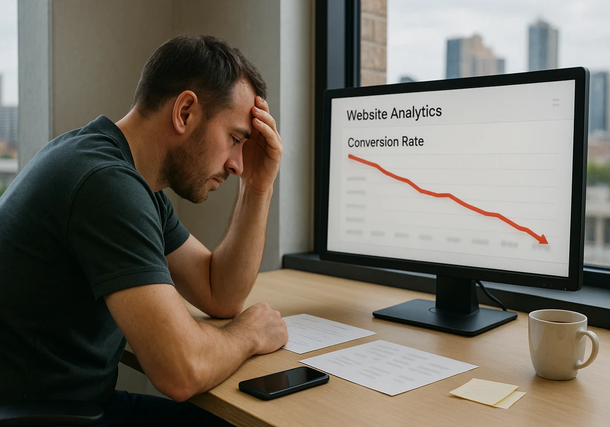
Last month, 1,000 people visited your site. Only twelve of them actually bought something. That makes a 1.2% conversion rate.
Now think like a visitor: you land on a page with a confusing headline and a hero image showing random suited people. You scroll, looking for a button, but three different buttons say different things. What do you do? You leave, just like the other 988 people did.
This guide shows you the exact problems that are costing you customers. You’ll learn web design conversion tips that fix these issues fast. And, a few simple tweaks that make your landing page into a conversion machine.
So, let’s find where you’re losing your customers.
Why Websites Fail To Convert Visitors
Websites fail to convert for three simple reasons: when a site’s design confuses people, page loads too slowly, or you can’t deliver a valuable message to visitors. And most websites lose clients with these common mistakes before they even scroll past the hero section.
You’ve spent hours building a site and making a copy. But if visitors can’t figure out what you offer in three seconds, they’re gone. Your effort is gone too.
In reality, people land on your page and start looking for answers to a few questions:
- Where do they click?
- What problem does this solve?
- Why should they care?
If the site’s design doesn’t guide them clearly, they’ll get frustrated and click back to Google. And don’t forget your competitors are one click away.
So, show people the value of your site fast; otherwise, watch them leave.
How Your Hero Section Loses Customers In Seconds
Ever wondered why people leave your site within three seconds of arriving?
The answer is right here. The hero section is the first thing visitors see on your site. It’s your one shot to make them stay. But it’s sad that most websites waste this chance completely.
If you don’t want to miss this chance, stop making the following mistakes:
Weak Headlines Without Clear Benefits
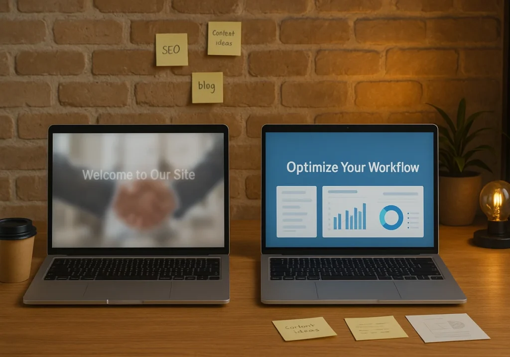
Your “Welcome to Our Site” message tells visitors nothing. Instead, use “Save 3 Hours Weekly on Email” since it tells them exactly what they get from your business. That’s the difference between a headline that converts and one that loses customers.
How does this work? Well, the hero image and headline need to work together to show value fast. For instance, if your headline talks about productivity tools, show the actual interface. Don’t overwhelm them with unnecessary things.
Hero Images That Don’t Match Your Message
Do you have those smiling people in suits shaking hands on your site? Everyone’s seen that photo a thousand times. When people spot fake imagery like this, it destroys trust instantly.
That’s why we use high-quality images showing real products. It helps customers to see themselves using your offer.
Fact: Real screenshots convert better than illustrations for your landing page. So, show the actual thing people will get.
Missing Or Buried Call To Action
You have built a beautiful hero section with a great headline and a perfect image. But where’s the button? If visitors have to search for your CTA, you’ve already lost them.
Your main CTA needs bold colours and clear copy. “Download Your Free Template” beats a vague “Get Started” message every time. So, place your conversion element where people actually look.
Design Mistakes That Kill Your Conversion Rates

The good thing about design mistakes is that they’re easy to spot and even easier to fix once you know what to look for.
Let us show you some design mistakes and how you can fix them quickly.
Too Many Form Fields Are Slowing Down Signups
Suppose the customer wants to download your free guide. And you are asking them for name, email, phone, company, job title, and budget. A long form with six fields. Whenever people see it, they simply close the tab.
For mobile users, it creates more friction to fill out forms on tiny screens. Drawing from our experience, removing unnecessary form fields can double your signups. First, ask for an email, get the rest later.
Slow Load Times Are Costing You Sales
When your landing page takes five seconds to load, visitors are gone by three seconds. If the visitor is a mobile device user, then he is leaving faster than a bullet train.
Our recommendation is to use compressed high-quality images that keep people engaged. You can use tools like TinyPNG to cut file sizes without losing quality. Fast pages mean more conversions.
Unlabeled Icons On The Landing Page Confuse Visitors
You have put a magnifying glass icon at the top. But what does that mean? Search? Zoom? Details? Stop creating this confusion because people don’t have time to guess what your icons mean.
Adding simple text labels instantly removes this confusion. For example, you can add “Search” next to the magnifying glass or “Menu” next to the hamburger. These clear labels help users navigate faster.
Poor Visual Hierarchy Hides Key Content
You are using the same size text and the same colour buttons on your site. Now, everything on your page looks equally important. There is no clear path for the eye. It’s a bad practice.
Choose a strong visual hierarchy that uses proper size, colour, and white space to guide attention. Your headline should be the biggest, and the CTA button should stand out with contrasting colours. These are important to retain your clients.
Why Mobile Users Abandon Your Site
Over 60% of web traffic comes from phones, yet most sites still treat mobile users as an afterthought. Don’t be like those sites.
Here are the issues that you can solve before losing your mobile user clients.
Tiny Text Nobody Can Read
You open a website on your phone. Then you noticed, the text is so small you have to zoom just to read the first sentence. Annoying, right? This is where Mobile-first design helps you and makes sure the fonts are readable from the start.
Pro tips: Use legible typography, which is one of the easiest web design conversion tools. For body text, use at least a 16px font size so that your potential customers don’t need reading glasses to use your site.
Buttons Too Small To Tap
Mobile users need buttons at least 44 pixels wide. That’s the minimum tap target size for fingers.
When CTAs are too small, people misclick repeatedly. That’s why finger-friendly design elements improve your site’s conversion. Always space your buttons apart and make them easy to tap.
Non-Responsive Layouts Breaking On Phones
Sites without a mobile-first responsive design push away most mobile users immediately. Mobile users face different problems with unresponsive sites, like text overlapping images, buttons disappearing off-screen, and form fields becoming impossible to fill out.
You should always prioritise mobile users to increase conversion. So, build a responsive sites that ensure your hero image, menus, and key benefits display correctly on any screen size. If needed, test it on both desktop computers and phones.

What High-Converting Websites Actually Do
Now that you know what’s breaking your conversions, let’s look at what the best websites do differently.
Single Clear Focus Above The Fold
The best site’s landing page shows one headline and one CTA button. That’s it. Nothing else competes for attention here. Too many choices freeze people instead of encouraging them to act.
You can do the same. Show key benefits and one strong CTA above the fold, and put in your conversion goal where users see it first. A focused message with your hero image converts better than cluttered design elements.
Trust Elements Placed Strategically
Everyone has their own preference for putting trust elements. Basecamp shows the customer count below their headline to increase trust. Meanwhile, Shopify puts trust badges near checkout.
Our in-house subject experts found that trust elements work best near the form fields. When someone’s entering their data, doubts arise naturally. Right there, a trust badge helps push potential customer decisions forward.
A/B Testing Every Design Element
A/B testing put the design to the test, like this or that term. Booking.com constantly tests its green button against blue. On the other hand, Amazon experiments with layouts weekly. They test to find what works for their target audience and new users.
You can do the same. So, test your site with real data from website visitors to know yours. Use tools like Hotjar to see where people get stuck in the process of converting.
Start Converting More Visitors Today
Your website doesn’t need a total makeover to see better results.
First, fix your hero section. Then, cut down those form fields that make people give up. Later, make your buttons easy to tap on mobile devices. Finally, test different versions and see what actually works with real data from your website visitors.
Remember: the sites that win focus on clarity over complexity.
Need expert help converting browsers into paying customers? JDDST in Brisbane builds websites designed to convert from day one. We’ll audit your current site, spot what’s costing you conversions, and create a plan that fits your business goals. Contact us today and let’s convert your traffic into revenue.