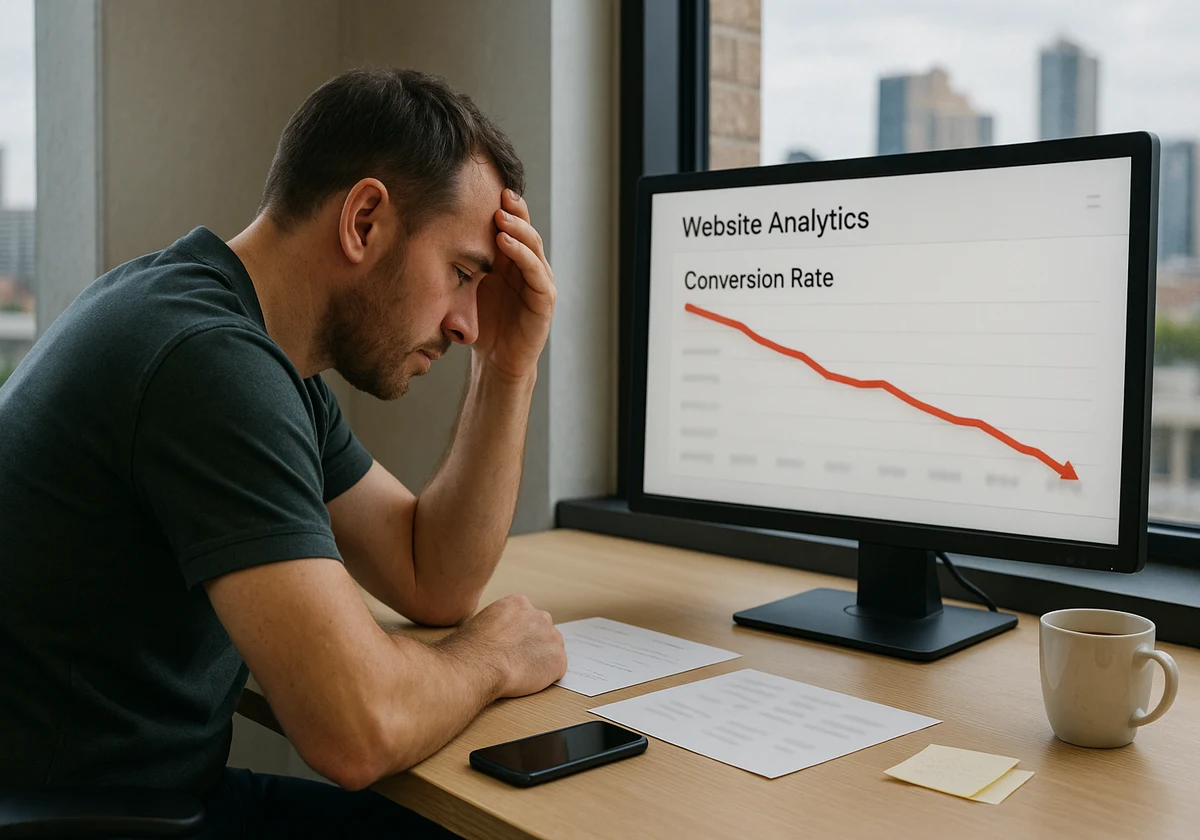
Are you struggling with your business website? You may have even hired a professional to build it. But you notice visitors aren’t staying around, and you’re not seeing the sales you expected.
The harsh truth is: even well-designed websites can fall flat because of a few common mistakes. But don’t worry, you don’t have to be an expert to fix these issues.
In this article, we’ll walk through five web design mistakes that Brisbane businesses still make and how to fix them. So, if you are ready to turn your site into something that actually works, then keep reading!
Mistake #1: Web Design That’s Hard to Navigate
Have you ever landed on a website and felt completely lost? That’s exactly how your potential customers feel when your site’s navigation is confusing. They click around for a few seconds, can’t find what they need, and leave.
Here are a few things your website should always consider:
Poor Navigation Drives Visitors Away
Poor navigation is one of the biggest design mistakes small businesses make. When visitors can’t easily navigate your site, they will leave. Drawing from our experience, we’ve seen a lot of Brisbane businesses lose up to 40% of their organic traffic because of confusing menus.
Create Clear Pathways to Products
Your website needs clear pathways to the products. If someone visits your online store, they should find products in two clicks, not five. That’s why you should use simple menu labels like “Services” instead of complex terms like “Solutions Hub.”
Add Helpful Navigation Features
You can add a search bar so users can quickly find specific information. But remember to keep five items or fewer in your main navigation. Seriously, isn’t it amazing how something so simple makes a big difference?
Avoid Overwhelming Dropdown Menus
Complicated menus confuse your users immediately. When you pack too many options into dropdown menus, people freeze up. Our team discovered that sites with menus of more than seven items create decision paralysis.
Bad Navigation Costs Real Money
Bad navigation doesn’t just frustrate visitors; it costs you money. And the numbers back this up: websites with improved navigation convert 18.5% better than cluttered ones. Apart from that, search engines also penalise sites with poor structure, which means less traffic and fewer clients.
Let’s do a quick test. Go to your website and find key information in three clicks. Did you find it? If the answer is “Yes”, then Congratulations! Otherwise, we recommend simplifying your menu structure and grouping similar services under clear headings.
Mistake #2: Ignoring Mobile Users in Your Design Process

Did you know, over 48.5% of web traffic in Australia comes from mobile devices? Yet small businesses still treat mobile as a second option, and it’s killing their online presence.
When your website looks perfect on desktop but breaks on phones, you’re decreasing half of your potential customers. Problems like buttons becoming too small to tap, text shrinking to unreadable sizes, and the site’s screen not being adaptable to mobile devices are the biggest red flags.
Unlike desktop users, mobile users expect immediate speed and simplicity. When they don’t get it, they bounce. We’ve even seen poor mobile design reduce conversions by up to 70%.
A website with slow loading times drives traffic away faster than anything else. This reason is enough for your site not to take more than two seconds to load.
Sometimes, large images are the culprit that makes your site take lots of time to load. So, first compress your images, then upload them.
Besides, search engines also prioritise mobile-friendly websites. That means your mobile site will also determine your search rankings. So, the design process needs to start with mobile, not end with it.
Mistake #3: Choosing the Wrong Content Management System for Your Needs
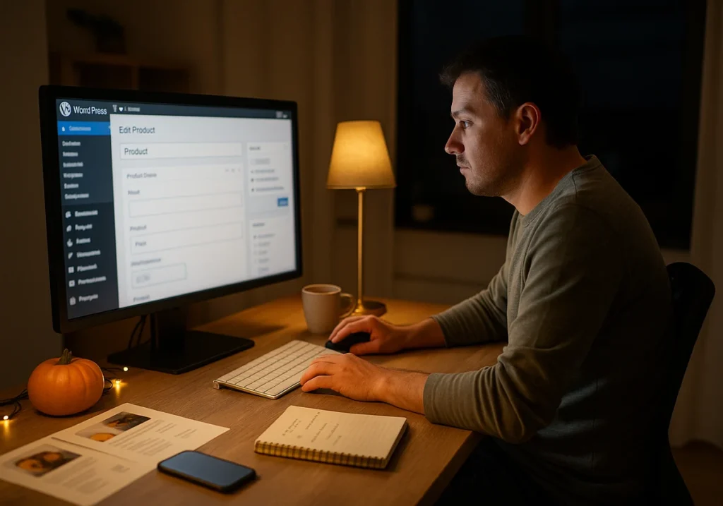
Imagine trying to update your own website at 10 pm, and a sale starts tomorrow. You log into your CMS and can’t figure out how to change a simple price. Frustrating, right? The simple solution is to choose the right content management system (CMS).
The content management system you choose affects everything. It determines how easily you manage content, what built-in features you get, and what your maintenance costs are. Our findings show that 35% of small businesses regret their initial CMS choice within the first year.
What does it mean, though? Well, it means wasted time, wasted money, and several weeks of frustration when trying to work with the wrong tools. So before choosing your CMS tool, consider what you actually need and think about how often you’ll update its content.
CSM tools like WordPress offer flexibility and thousands of plugins, but require more technical knowledge. Platforms like Squarespace, on the other hand, will provide beginner-friendly drag-and-drop editors. And if you want to plan a business, Shopify might suit you better.
Why are we suggesting so many tools? Because your investment in the right content management system will pay off quickly.

Mistake #4: Your Business Website Looks Stuck in 2010
Websites that still use stock photos of people in suits shaking hands scream “outdated,” and visitors notice it immediately.
Consider these basic design problems to make your site look outdated:
- Your visitors’ first impressions are formed in 0.05 seconds. When someone visits your website with an old-school design, they assume your business is outdated, too. It directly impacts the trust and credibility of your site.
- Old visual elements kill conversions with tiny text, cluttered layouts, and low-quality images. Plus, it also hurts your search engine optimisation.
- If your website has animated text that blinks or scrolls across the screen, then you have created an annoying website. A website has to be modern and have plenty of white space to create focus.
You might be wondering why solving these problems is so significant for credibility. Frankly, it’s because people judge websites in the same way they judge storefronts. (Trust us! The greater the first impression, the more potential customers.)
Modern users expect clean layouts, readable text, professional images, and secure connections on their first visit. When your new website delivers these basics, visitors relax and engage with you.
Pro tip: Add alt text to images for better accessibility.
Mistake #5: Small Businesses Ignoring Their Online Presence with Weak Content
You could have the most beautiful site in Brisbane, but if your message is unclear, you’re still losing sales.
Many small businesses forget that they built their site to attract ideal customers and drive traffic toward specific actions. Just presenting “We provide quality services” can’t attract customers. Instead, try saying “We help Brisbane cafes reduce food waste by 40%“, which tells them exactly what they want to know.
Usually, generic content wastes everyone’s time. When you don’t speak directly to your target audience, they don’t understand your message. So, you have to add specific content to your site that outperforms generic statements.
Every page of your website should guide visitors toward something. It should not spread content across pages without clear next steps. Because great web design creates a journey, a customer’s trust.

Time to Fix What’s Broken
These five mistakes are holding Brisbane businesses back day by day. But here’s the relief for you: every single problem has a solution. Start auditing your existing website against these points from today. Pick the biggest issue and solve it first.
If you need help in identifying what’s holding your site back? Our team at JDDST will do it for you. We specialise in building websites that work for Brisbane businesses.


